Got To Go
How might we help users access bathrooms that meet their standards as fast as Google Maps?
Skills Developed:
User Research, UX Design, Collaboration, Figma
Team Members:
2 Designers, 2 Researchers, 1 Project Manager
Project Overview:
My professor challenged our team to create an application with the goal of improving the lives of Toronto citizens. My role in this project was to conduct user research to create a mid-functioning application, developing research studies to gain data that will influence the design of wireframes, visuals and an interface.
My Process:
Toronto faces inadequate public bathrooms that are not accessible to its communities. Existing efforts are insufficient, directing individuals to establishments with financial barriers, that may be unaffordable.
Research Findings:
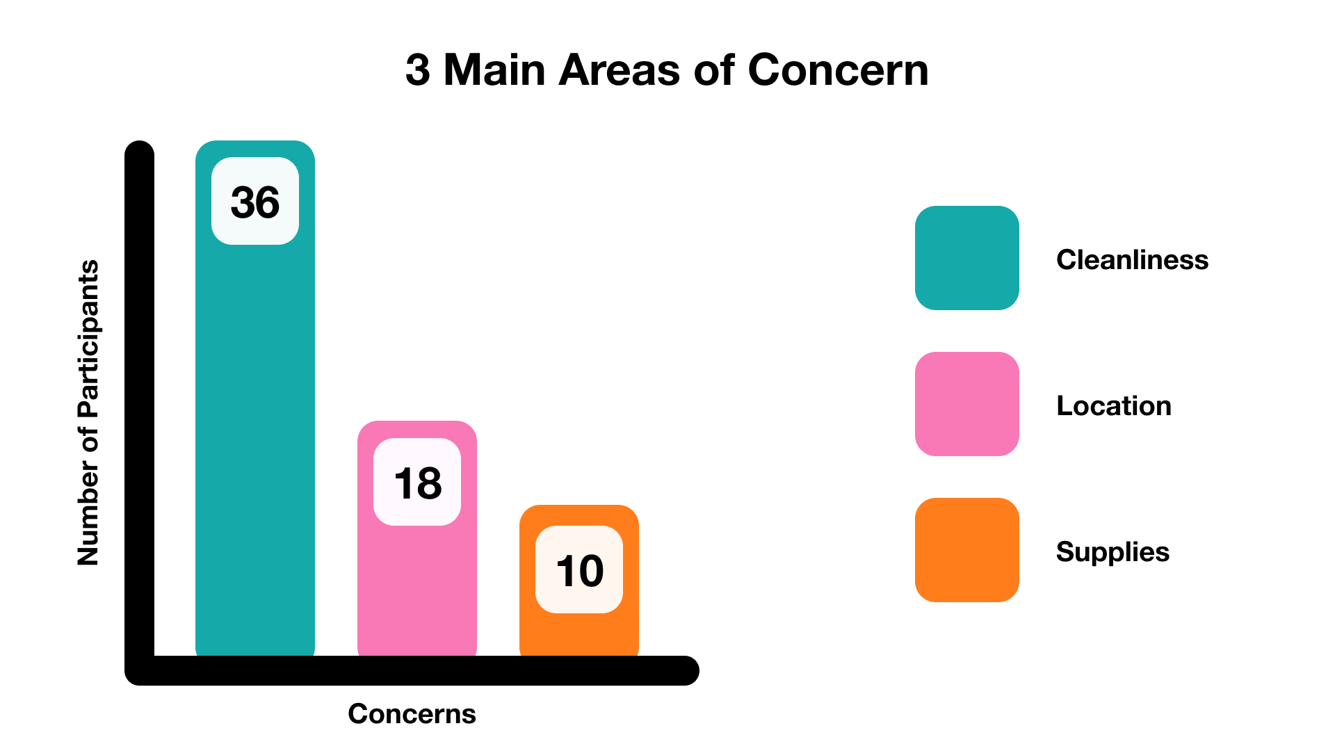
To further our understanding of the problem at hand, my team conducted 36 surveys, and 10 interviews.
SURVEY DATA
97%
of participants have used a public bathroom within the last two weeks
81%
of participants said they refrained from using a bathroom due to lack of accessibility or cleanliness
76%
of participants said they have waited in line to use a bathroom
INTERVIEW DATA
My team created an affinity map with the collect interview data to represent the common experiences and feelings when accessing a public bathroom in Toronto.
Each dot on this chart represents one user who agrees with what is written on the sticky note.
People frequently use their phones to locate clean bathrooms, often favoring places like universities.
Although pay-to-use bathrooms are perceived as cleaner, users are reluctant to pay for access.
Accessibility concerns include the absence of wheelchair access, basic features (such as a functioning lock), and essential amenities (like toilet paper).
Common negative emotions associated with bathrooms include frustration and anxiety about potential unserviceability.
Meet Chloe
What Chloe Needs:
Chloe needs a way to locate a suitable bathroom nearby so that they can access it quickly.
Chloe needs a way to check what amenities are available so that they can ensure her comfort.
She needs a way to assess bathroom cleanliness so thats they can guarantee its hygiene before she travels there.
They need a way to find out expected wait times so that they can explore other alternatives beforehand.
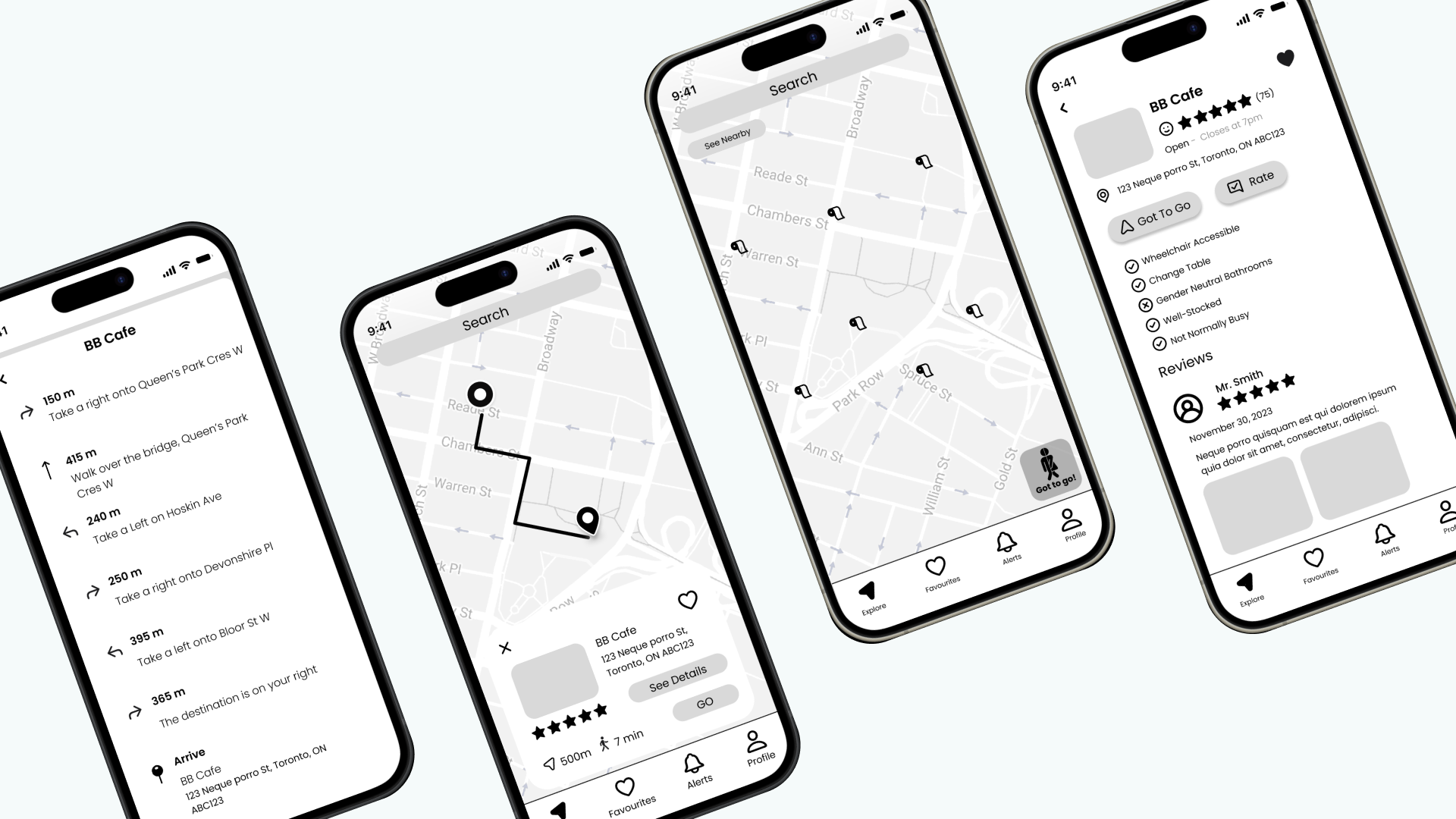
Low-Fidelity Wireframe:
To implement and test our solutions we created iteration 1, representing our four main tasks.
TESTING RESULTS
Participant Feedback
Appreciated that the app followed conventions - found it was similar to Google Maps
Was confused about whether to use the Search option or the See Nearby button at first
Thought the app was intuitive - good that they can search in different ways
Appreciated the emergency Got to Go button
Recommendations
Would like to see more back buttons to allow for more seamless navigation
Would like to see a “Bathroom History” as page would make it easier to favourite bathrooms after usage
We have created a minimum viable prototype of an application that supplies users like Chloe with an accessible way of choosing bathrooms that meet inclusive standards. This empowers users to quickly and effectively access bathrooms at their fingertips. This easy-to-use interface resembles industry standards of popularized mapping systems on mobile.

Evaluation:
With our iteration 2 prototype ready, my team and I conducted usability testing on 10 participants.
METHODOLOGY
Semi-Structured Interview
See why they made their decisions in more detail
Allow our users to discuss any other issues
Think Out-Loud Evaluation
Get a good idea of their thought and feelings
Seeing how users think in real time.
FINDINGS
Next Steps:
With our findings from user-testing, our team will implement two main changes to the design during the creation of the high-fidelity prototype:
We will specifically remove the ‘Alerts’ page from the navigation bar as it was widely deemed as unnecessary.
We will also implement a ‘Got To Go’ icon within the navigation bar, removing the FAB and ‘Search Nearby’ from the main page.

For now, I have Got To Go 👋🚽
Lessons Learned:
The project taught me the value of diverse perspectives, clear communication, and ethical research practices to prioritize participants' needs.
Reflecting on the experience, I now believe integrating the application as an extension of Google Maps—rather than a standalone app—would be more effective.
By aligning with a trusted tool, the application would gain broader adoption and provide greater value with minimal effort from users.