
Textile Museum of Canada
In partnership with the University of Toronto, we offer a critique for the Textile Museum’s Information Architecture and Navigation Design

Skills Developed:
Information Architecture, Navigation Design, Client-Based Collaboration
Timeline:
Three Weeks
Tools:
Figma, Miro, Optimal Workshop
Team Members:
Jeanelle Suarez, Saman Zubair , Yingying (Jane) Zhu
Project Overview:
This project is for a Master level Information Architecture class at the University of Toronto where students worked with The Textile Museum of Canada to create a responsive redesign of their mobile and desktop site.
This redesign focuses on our client’s goals for the site as they wish to:
Appeal to a wide audience, specifically of a younger age group
Highlight community partnerships and opportunities for involvement
Improve discoverability of events hosted by the museum
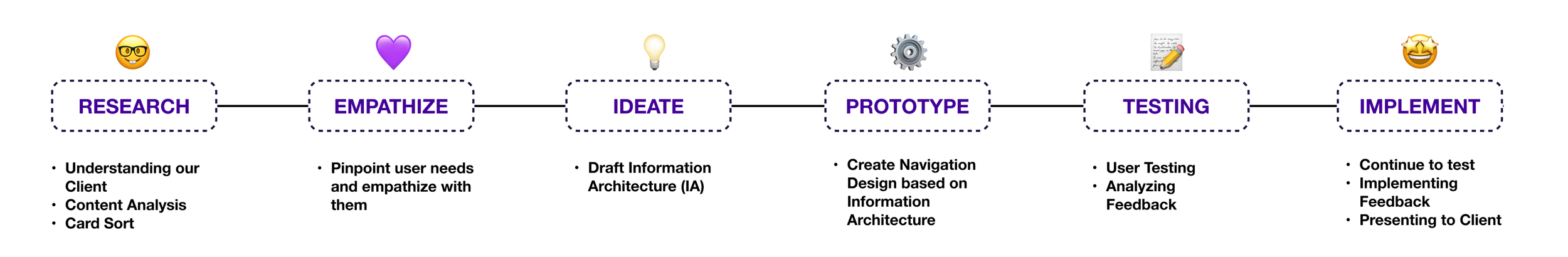
Design Process:
My Role:
Led group discussions as we collaborated through all steps of the design process. Gathered and analyzed testing data to utilize in written our written report. I also collected our results, putting together a presentation we pitched directly to our clients.
Client: Coursework for Information Architecture with University of Toronto
Platform: Desktop and Mobile
Content Audit:
Using Dynomapper, our team conducted a content audit to identify 43 pages within the current site. After going through each page, identifying misleading or absent content, we decided on 60 pages to include within the updated Information Architecture.
Card Sort & Affinity Map:
Of these pages, we selected 38 pages to conduct card sorts with 8 individuals on Miro. Participants were asked to do an open sort exercise with follow-up questions to gather information on problematic pages.
With the results of the card sort, we created an affinity map to visualize the feedback we had gathered.
We found pages that had:
generic labeling
unclear and ambiguous labeling
do not follow industry standards


Information Architecture (IA):
With the results of the card sort in mind, we organized our Information Architecture diagram accordingly:
Cards with broad labels were commonly identified as top-level pages
6 out of 8 participants looked for industry standard labels as category titles
4 out of 8 participants utilized these labels as top-level categories: Donate/Give, News, Visit, About and Collection
Cards with specific branded names (ex. TXTile city) were difficult to sort
I decided against relabeling these, as they are names of specific projects. Instead, we created an overarching label to encompass the pages, “Digital Projects”
Cards could be interpreted differently if the label is unclear
This indicated that parent pages needed a distinct label so that more specific, child pages had a definitive home
With this in mind, I created a label “Get Involved” to encompass “Join” and “Support” as these separately can entail joining the careers team, or supporting through donations

Balancing Depth, Industry Standards, and Prioritized Touchpoints
The website design approach emphasizes a balance between depth and breadth, limiting pages to seven sections to prevent overwhelming users with too many initial choices. Participants in the card sort process drew on industry standards and patterns, using their memory of other museum websites to inform the organization method. The prioritization of touchpoints involved listing pages related to the museum's business goals first within the diagram, ensuring a strategic focus on key elements.
Navigation Design:
Original Site Screen Captures:
Things to Fix:
There is no utility navigation on the home page. The have side options that includes hours, tickets, and contact information. Yet some of these have interactions, while others do not, leading to inconsistencies.
The original homepage’s navigation bar that is not accessible directly upon opening the site.
The current footer takes up a significant amount of space on the desktop site, which may come across as overwhelming. The footer’s text is also extremely small and spread out across a large surface area.
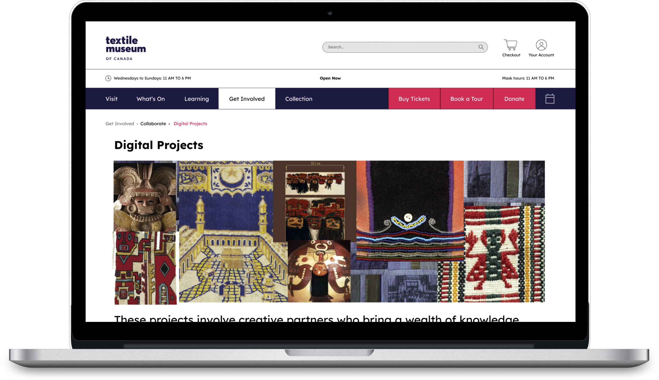
Redesigned Site Screen Captures:
Redesigned:
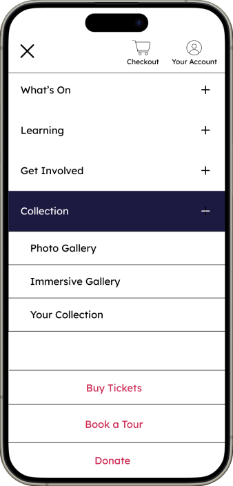
As seen above, the hamburger menu would be better utilized in the mobile website, as it prioritizes organization and use of space while maintaining the Textile Museum aesthetic. We created a dropdown menu for additional organization and hierarchy. This reduces cognitive overload as we streamline user experience.
We also implemented an interactive utility bar, as users can now immediately search through the site to find specific results as fast as possible. Here, they can also sign up and access their cart to purchase tickets, memberships and even donate.
Above the horizontal menu, is a static bar that shows the museum’s hours, highlighting client’s wishes to specifically add “Masked" hours
When redesigning the footer, I wanted to create a concise reference point for users to refer to when navigating important parts of the site. In this redesign, we made it significantly smaller, as it previously covered the entire page with a concise and stacked layout.
Original Mobile:
Updated Mobile:
On the mobile site, we implemented a concise format and added a hamburger menu to prioritize cleanliness and use of white space.
We matched the dropdown menu of the desktop screen and implemented it into the mobile prototype to improve discoverability of information. This prevents users from getting lost or overwhelmed with information
Next Steps:
Increasing Participant Testing Scope:
Despite the course ending, I would like to increase the level of user-testing, which a diverse audience. We conducted tree testing with the final product among 10 people.
Thus, from here on out, we will expand our scope, and further reiterate our design with the feedback provided to us.
Results:
With our redesigned desktop and mobile site, I designed and put together a presentation to pitch it to our clients. This was extremely successful, as we received a 95% on the assignment.
Feedback from one of our stakeholders:
“Fantastic work on the presentation today! Your impressive showcase of card sorting, IA diagram, task flows, and navigation redesigns marks a successful conclusion to the lectures.”
Takeaways:
Gained invaluable experience working with stakeholders:
Stakeholders are not always right, but it is our job to convince them of alternatives to what they may want.
I also learned the importance of disagreements. When debating aspects of our information architecture, my members and I would often disagree of where a certain page would belongs. With this, came problem-solving, research and understanding as we came together and created solutions.